Texture and patterns are two of the most important elements of design. They can be used to create visual interest, add depth, and create a unique look. Texture and patterns can be used to create a sense of movement, create contrast, and add a sense of texture to a design. They can also be used to create a sense of balance and harmony. In this article, we will explore how texture and patterns can be used to create better design. We will look at how they can be used to create a unique look, create contrast, and create a sense of balance. We will also discuss how they can be used to create a sense of movement and texture. Finally, we will look at how they can be used to create a sense of harmony and unity.

Role of Texture
Texture plays an important role in design, as texture helps to create the visual and tactile impression of a surface or object. It can be used to add visual interest to a design, and to create a certain feeling or atmosphere. Texture can also be used to draw attention to certain elements of a design, such as a bold pattern or a specific color. Texture can also be used to create an illusion of depth or movement in a design. For example, a designer might use different textures to create a 3D effect, or to give a design a sense of motion.
Other than that, texture can also be used to bring a sense of sophistication and luxury to a design, or to give it a more rustic or natural feel. In general, the use of texture in design can help to create an atmosphere, to draw attention to particular elements, and to give a design a certain feeling or aesthetic.

Role of Patterns
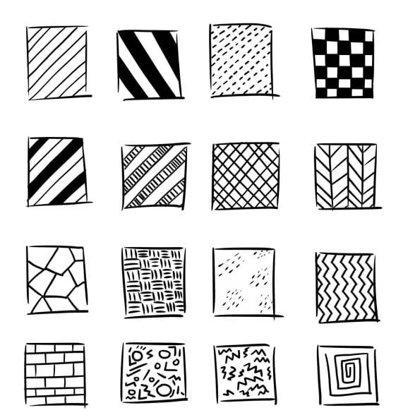
Patterns are essential to design because they provide a visual cue that helps to create a sense of order and organization. They can be used to create a sense of harmony and balance in a design, as well as to create visual interest. Patterns can be used to add emphasis to certain elements, or to create a contrast with others. Patterns can be used to evoke a certain feeling or emotion, or to suggest a certain lifestyle or message.
Additionally, patterns can be used in a variety of ways to create a unified look and feel, from subtle to bold. They can be used in a creative way to create a unique design or to help create a unified look for a product. Patterns can be used to create a sense of rhythm and flow, to add visual interest, to create a sense of movement, or to add texture and depth to a design. Patterns can also be used to create a sense of unity and consistency throughout a design, as well as to create a sense of cohesion. Patterns are essential to design and can be used in a variety of ways to create a unified look and feel that will help to make a design stand out.
Combination
Texture and patterns are two of the most important elements of design. Texture is the physical feel of a surface, while patterns are the repetition of shapes, lines, or colors. When used together, texture and patterns can create a unique and visually appealing design.
When used together, texture and patterns can create a unique and visually appealing design. For example, a textured background can be used to create a sense of movement and energy, while a patterned foreground can be used to create a sense of rhythm and repetition. The combination of texture and patterns can also be used to create a sense of depth and dimension, as well as to create a sense of unity and harmony. By combining texture and patterns, designers can create a unique and visually appealing design that stands out from the crowd.
Conclusion
In conclusion, texture and pattern play a crucial role in design and can elevate a design to a whole new level. Texture adds depth and dimension to a design, while pattern adds interest and movement. When used together, texture and pattern can create dynamic and interesting designs that stand out. As a designer, it’s essential to understand the power of texture and pattern and how to effectively use them in your work. Remember that the use of texture and pattern should be done with a purpose, and not just for the sake of it, it should be used to enhance the overall design and strengthen the message. Check out Artmeet for more blogs.

