Design is an essential part of any successful project, whether it is a website, a piece of software, or a physical product. With the right design, a project can look and feel amazing, while still being easy to use and navigate. Unfortunately, good design is not always easy to achieve. Unlocking the Secrets of Good Design: Tips and Tricks is a great resource for anyone who wants to learn more about the principles of good design and learn how to apply them to their own projects.

Rule of Third
The Rule of Thirds is a compositional guideline used in photography, art, and design. It is a principle of balance and visual harmony that divides the image into thirds, both horizontally and vertically, creating four points of intersection. This creates an evenly distributed grid across the frame which can be used to position the main focal point of the image. The Rule of Thirds helps to create a more balanced composition and can help draw the viewer’s eye to the main subject of the photograph. It also creates a sense of dynamism, as the subject isn’t static or centered in the frame. For extra information take a look at this website.

Simplify
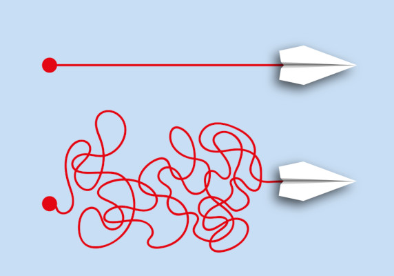
Simplifying your design means stripping down the design to its core elements and eliminating any unnecessary or distracting elements. It can also mean using fewer colors, fonts, and shapes, as well as focusing on a single purpose and message. By reducing the complexity of the design, it can help create a more cohesive and aesthetically pleasing overall product. Additionally, simplifying your design can help ensure that the design is easy to navigate and understand. By taking the time to simplify your design, you can create a product that is more effective and successful.

Color Theory
Color theory is a fundamental element of good design. It is the practice of using colors, as well as their combination, to create a visually appealing piece. It is important for designers to understand the psychological effects of colors and how it can affect the viewer’s experience. By understanding the basics of color theory, one will be able to create a design that is both aesthetically pleasing and emotionally stimulating.

Utilize Negative Space
It is the area between and around elements that creates an aesthetically pleasing composition. Negative space helps to draw attention to the positive elements and add emphasis to the overall design. By carefully arranging the positive and negative elements, designers can create a pleasing design that stands out and makes an impact. Negative space can also be used to create visual hierarchy, guide the viewer’s eye, and lead them through the design.

Testing
Testing your design is the key to creating good design. It involves the process of assessing the design to determine its effectiveness in meeting the desired objectives. Testing can involve user testing, usability testing, and other methods. Testing helps ensure that the design meets the goals and objectives of the project, and that the design is effective and usable. Testing can also provide valuable feedback to help improve the design and make it more effective.
Conclusion
In conclusion, unlocking the secrets of good design requires an understanding of the principles of good design, an eye for detail, and a willingness to experiment and learn from mistakes. With a little practice, anyone can become an expert at creating designs that make an impact. Learn and polish your basic design skills all over again Artmeet.

